
There’s a point in most redesigns where the team stops removing clutter and starts removing information, and nobody in the room notices, because the mockups keep getting better looking. Everyone reviewing the work already knows where every function lives. They’re the worst possible test group for whether anything is still findable.
That’s the trouble with minimalism as a house style. Subtraction always looks like discipline in a static comp. It only shows its cost when somebody who has never seen the screen before needs to do something on it in a hurry.
What usually goes first
Boundaries. Buttons lose their edges, input fields lose their borders, and the difference between a control and a label becomes a small change in font weight. Then body text drifts to light gray on white and drops under the 4.5:1 contrast ratio WCAG asks for normal text (W3C). In a design review none of that registers as a functional change. It registers as restraint. On a five year old monitor, or on a phone outdoors, it registers as a form the user can’t see.
After boundaries, labels. Icon-only toolbars are the common version, and they work fine for the handful of icons everybody already knows and badly for everything else. Hamburger menus do the same thing at a larger scale, hiding the entire structure of a site behind one symbol so the homepage can look calm. The functions are still there. They’re there the way a spare key is still there when you can’t remember which drawer.
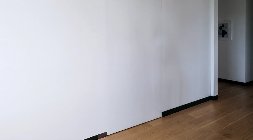
Physical space plays out the same way. Flush cabinet pulls, unmarked doors, retail interiors with no signage because signage would spoil the room. The cost isn’t aesthetic. It’s a staff member answering the same fitting room question all day, and customers who pause outside because they can’t tell whether the place is open.
The cost shows up somewhere else
Car interiors are the clearest case. Climate and audio controls moved onto touchscreens, and the touchscreen version does look better in a press photo. A knob can be found by hand, at speed, without looking away from the road. A sheet of glass can’t, because every part of it feels the same. Euro NCAP’s 2026 protocols added an assessment of the human machine interface that looks at the placement, clarity, and ease of use of essential controls, including whether commonly used functions still have physical buttons. A car safety rating body is now scoring interiors on whether you can work them without looking, which is an odd place to end up after a decade of selling screens as modernization.
Software corrections tend to arrive quietly, putting back the things that were taken out. Apple’s rework of Liquid Glass in macOS 27 added darkened edges around interface elements, a uniform toolbar so buttons stop competing with the content behind them, and colored sidebar icons for whichever app is in focus. Separation, contrast, and color. All things the first version treated as noise.
Here’s the tell. If a simplified interface needs onboarding, coach marks, tooltips, or a help article explaining where a feature went, the complexity didn’t go anywhere. It moved onto the user, and onto whoever staffs the support queue.
Decoration is safe to remove. Information isn’t, and a lot of what gets waved off as decoration is load bearing. Labels, contrast, edges, visible state, hierarchy. Before deleting an element, somebody should be able to say what job it was doing. “It looked busy” isn’t an answer.
Minimalism is a claim that everything still on the screen is doing work. It’s a good claim to make and a hard one to earn. Just be able to name what the missing piece was doing, because someone is going to go looking for it, and they won’t be in the room to ask.
