
“We’re open to anything” sounds generous. It’s the worst brief you can get. Nothing in it tells you when a decision is right, so every option stays live and every choice has to be argued from scratch. Two weeks in, you’re staring at four directions that are all defensible and none of which can be tested against anything except taste, which is how projects turn into a series of opinion contests.
Now take the opposite. The alcove is a fixed width. The budget is set. It has to ship before the store opens. Half the people using it are standing, not sitting. That project is not worse. It’s already half designed, because most of the bad ideas have been eliminated before anyone opens a file.
Real constraints tell you when to stop
A useful constraint does two jobs. It removes options, and it gives you a pass/fail test you can run without convening a meeting.
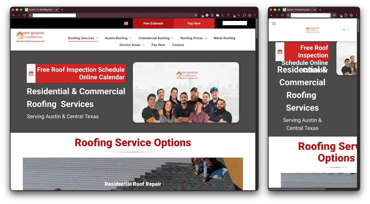
Narrow screens are the easiest example in software. If a page’s hierarchy falls apart at phone width, the hierarchy was decorative. The constraint doesn’t ruin the design so much as reveal that the design was carrying five things labeled “most important.” Something has to go first, something has to go last, and now you have to actually decide which.
Budget works the same way. A tight number tends to push people toward cheaper materials used honestly rather than expensive-looking materials used badly. Plywood with a clean edge detail ages better than thin veneer pretending to be something it isn’t, and it fails more gracefully when someone drags a chair across it.
Deadlines do the ugliest and most useful version of this. Cutting scope under time pressure is unpleasant, and a surprising amount of what gets cut is never missed. Nobody writes a support ticket asking where the animated intro went.
Accessibility requirements are the clearest case of a constraint that improves work beyond its stated purpose. Contrast minimums, keyboard access, and adequately sized targets are written for people with specific needs, and they quietly rescue everyone reading a screen outdoors or tapping a button on a moving train. The WCAG guidelines are worth treating as a design input rather than a compliance chore at the end.
Arbitrary constraints only look like requirements
Not every rule handed to you is doing this kind of work. The test is simple: ask what actually breaks if you violate it.
A real constraint has a consequence outside the room. The drawer hits the door. The page doesn’t load on hotel wifi. Someone can’t read the error message. It misses the delivery date. An arbitrary constraint has a consequence inside the room. Somebody is disappointed.
Brand guidelines that ban an entire color range, including the reds you need for errors. A CMS purchased before anyone scoped the project. A required hero video on a site whose users are mostly arriving on cellular to find a phone number. A mandate to “feel more like” a competitor, which usually means copying their layout without their business.
The difference matters because real constraints get more useful the longer you work inside them. They keep paying out, narrowing the field and catching mistakes. Arbitrary ones only consume effort. You spend hours engineering around a preference that nobody will defend in six months, and the result reads as slightly confused because it is.
The constraints people pretend they don’t have
The other failure is designing as if constraints you know exist won’t apply to you. Content will grow. Staff will turn over. The person who understood the system will leave. Whatever you build will be maintained by someone with less context and less time, probably on a Friday.
Physical projects run into this constantly, which is why measurements alone are such a weak brief. A previous Hydrocode piece on the design phase of a commercial furniture project makes the point well: dimensions tell you what fits the room, not what fits the work, and a counter can be perfectly sized and still block the sightline somebody needs all day.
Future flexibility is a constraint too. It just doesn’t announce itself until the reorganization happens.
So when a project feels stuck and wide open, that’s usually not a creative problem. It’s a research problem. The constraints exist. Budget, bodies, physics, deadlines, the way people actually move through the space, the equipment nobody mentioned. Someone just hasn’t written them down yet. Go find them, and the design gets easier, not narrower.
