
When Apple rolled out Liquid Glass across macOS Tahoe last fall, the pitch was depth, refraction, and a design language that finally felt unified from the watch to the desktop. What a lot of Mac users got instead was a sidebar they had to squint at, toolbars that blended into whatever document sat behind them, and a laptop that ran hot for reasons nobody asked for.
The backlash was loud and it never really stopped. On r/applesucks, a post calling Liquid Glass Apple’s biggest flop since the Newton pulled 200 comments and turned into a running support group for people who felt like their hardware had been downgraded by a software update. The complaints clustered in predictable places. Transparency fights with content, so small text and icons compete with whatever is behind them. Fake depth on a flat screen scatters focus instead of organizing it. Glows and borders were inconsistent from app to app, which is a strange thing to say about Apple. And the battery cost landed hardest on people running older machines and phones, where a year-old device suddenly stopped making it through a workday.
That last one is worth separating from the aesthetic argument. Plenty of people said they could live with the look. Fewer were willing to live with an M2 MacBook losing real hours of runtime for a visual effect, and Mac users in particular reported downgrading back to Sequoia and staying there. Accessibility was the other sore spot. Reduce Transparency helped, but it was a blunt on-off switch that broke wallpapers and introduced its own rendering weirdness, and for anyone with contrast sensitivity it never went far enough.
Apple’s public posture through all of this was that Liquid Glass was here to stay. That turned out to be half true.
At WWDC26 in June, Apple’s human interface design director Shubham Kedia told developers the company had updated the foundations of how Liquid Glass is built, framing it as the normal cycle of taking a bold leap and then iterating. Translated out of keynote language, Apple kept the material and rebuilt the parts people were actually complaining about.
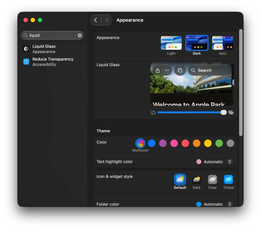
The headline change is a slider. Instead of the binary Reduce Transparency toggle, iOS 27, iPadOS 27, and macOS 27 add a control in Settings that runs from ultra clear to fully tinted, so users can dial the effect wherever they want it. Push it right and you get contrast and readability. Push it left and you get the glassy look Apple demoed last year. Underneath that, Apple retuned how the material handles content behind it so it diffuses complex backgrounds more effectively, and added a darkened edge around Liquid Glass elements plus brighter specular highlights to restore visual separation.
There is a familiar lesson buried in all of this. In commercial furniture, the design phase is where a project is won or lost, because a problem caught in a 3D model costs nothing to fix and the same problem caught during installation costs rework, materials, and time. Software is supposed to be the medium where that math does not apply, since you can always ship a patch. Tahoe is a good argument that it applies anyway. Apple shipped a design language to hundreds of millions of installed devices, then spent a year and a full release cycle fixing things that a harder look at readability would have caught before fabrication.
The Mac-specific fixes read like a list scraped directly off the complaint threads. Corner radius is now consistent across every app, applied automatically without developer work, including third-party apps. That inconsistency was one of the odder tells that Tahoe shipped before it was done. Sidebars extend to the edge of the window, and colored sidebar icons come back, though only for the app currently in focus. Color returning at all is a small concession, since stripping it out was one of the more divisive calls in the original design.
Apple also brought back a uniform toolbar running across the top of Mac apps with a frosted treatment, so buttons stop competing with the content underneath. Window corner radius got tighter as well. None of that is glamorous. All of it is the kind of thing that makes a desktop OS usable eight hours a day.
The wider framing around macOS 27, which Apple named Golden Gate, is Snow Leopard energy: fewer new features, more attention to battery life, app launch times, and general responsiveness. Bloomberg’s Mark Gurman had reported ahead of the conference that the work was aimed less at reinvention and more at repairing usability problems, and that Liquid Glass had struggled specifically in the jump from phone screens to large displays.
Whether that satisfies the people who spent a year with Reduce Transparency cranked on is another question. Apple did not apologize, did not ship a rollback, and did not offer a way to opt out of the design language entirely. What it did was admit, in the only way Apple ever admits anything, that the first version prioritized the wrong things. For anyone who bounced off Tahoe and stayed on Sequoia, that is probably the signal to try again in September.
